Sometimes I just sit down and play in the sandbox. There's no agenda. There's no pre-planned goals. It's just having fun in the Adobe universe.

OBJECTIVE:
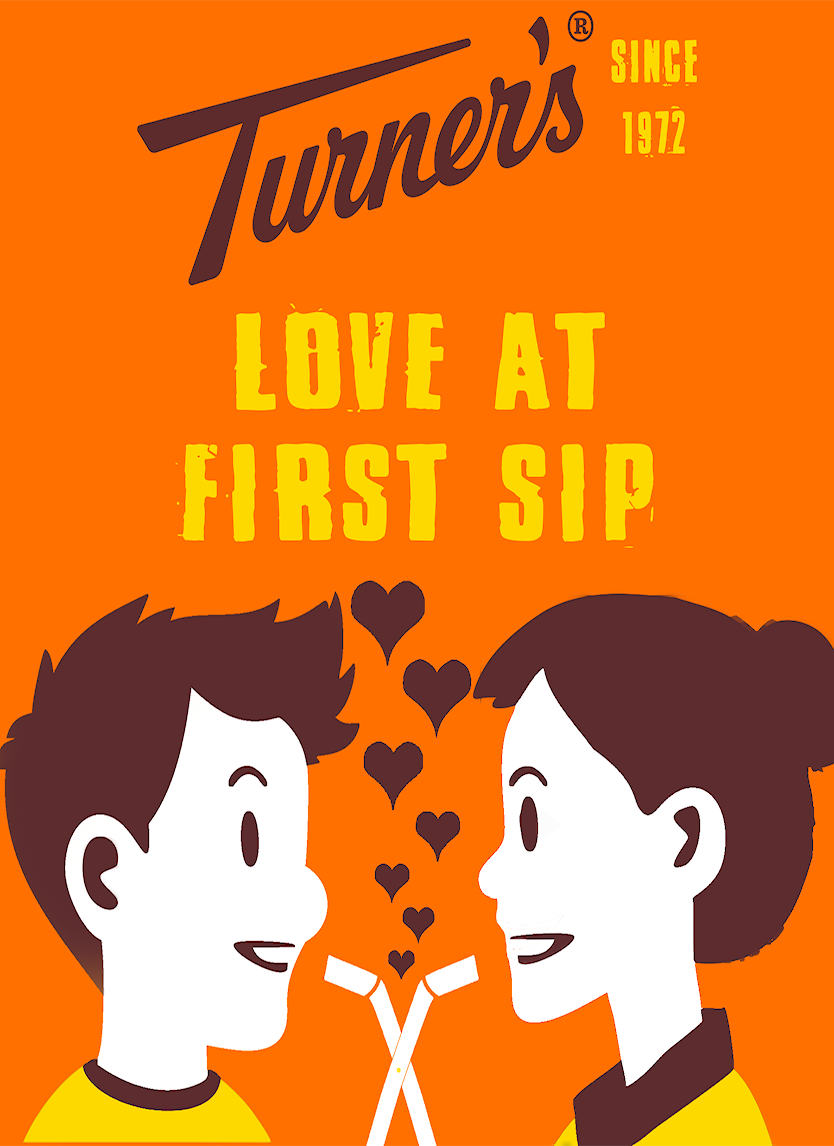
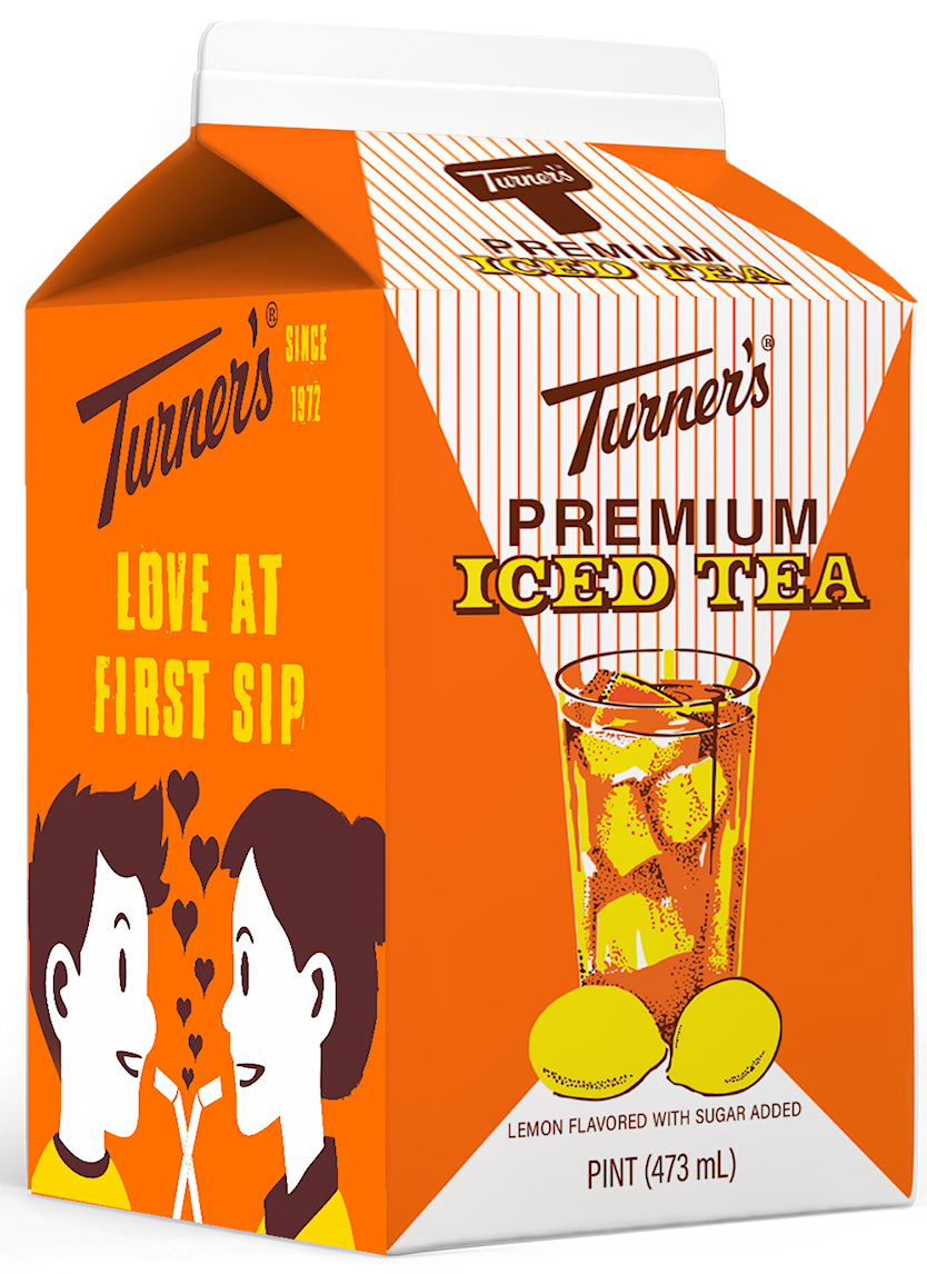
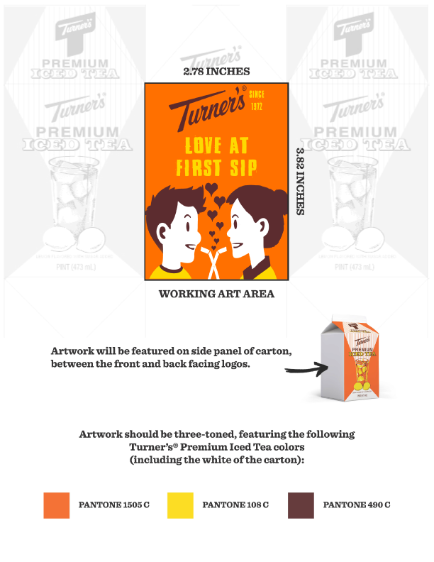
Create a design for the annual tea cARTon contest held by Turner's Dairy Farms. The concept was inspired by the memories of the first sip of the elixir of the yinzer gods that is Turner's Tea. One's first schoolyard crush may have have played a small hand in it as well.
RESULT:
This was one of my favorite pieces I've ever done. It was fun to just put some work aside and design something for fun; something just for me. While I was not named a finalist, amongst dozens of other really great artists, I did have some small-scale virality on my LinkedIn page with ~2,000 impressions and led to several new followers.
OBJECTIVE:
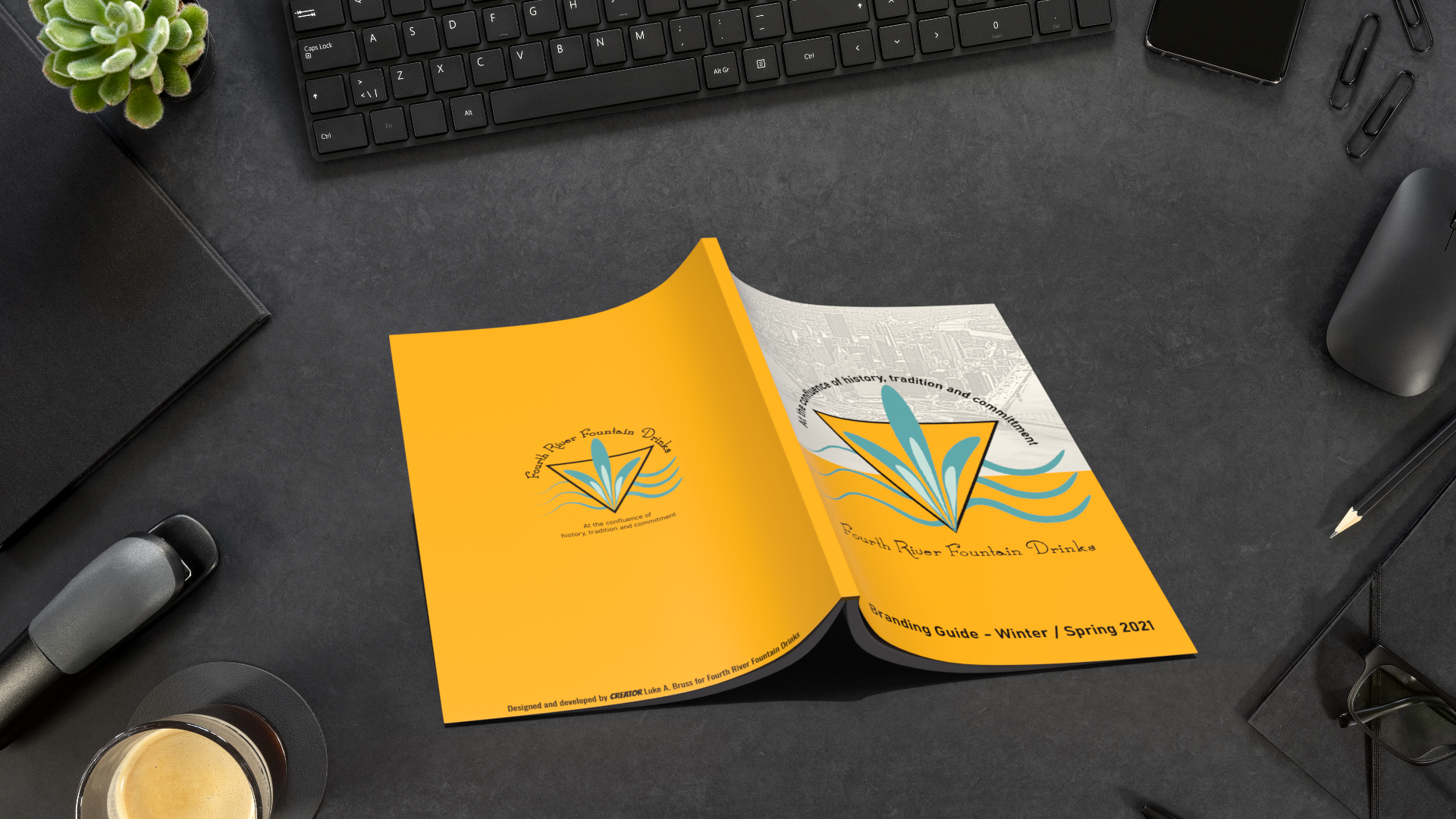
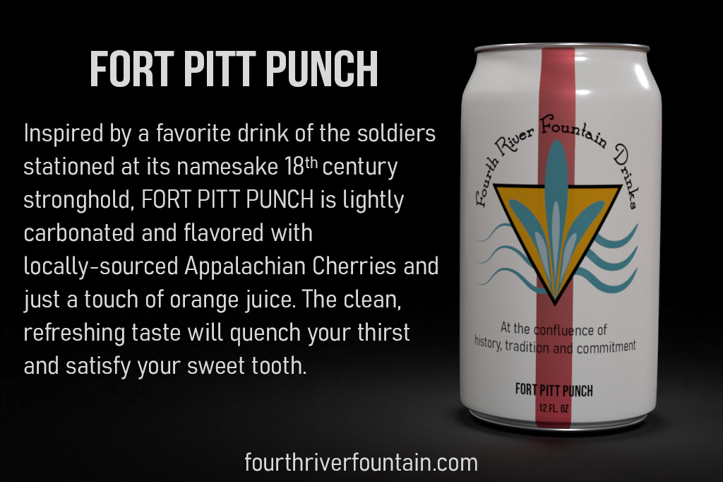
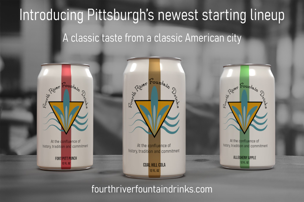
Expand my knowledge of Adobe InDesign and Dimension and copywriting by creating a materials for a fictional soda company. A series of cans, print and digital ads, and a branding guide with a breakdown of the brand identity were included.
RESULT:
I am very well-versed in Illustrator, InDesign and Photoshop, and although I've always been fascinated with the 3D development space, I haven't really been able to commit the time to learn it properly until the past year or so. Creating the can, branding guide, and a number of other pieces has given me the skills that bled into my work with J.V. Hilliard, for whom I created several promotional products including dice bags, backpacks, convention signage and other collectible items.
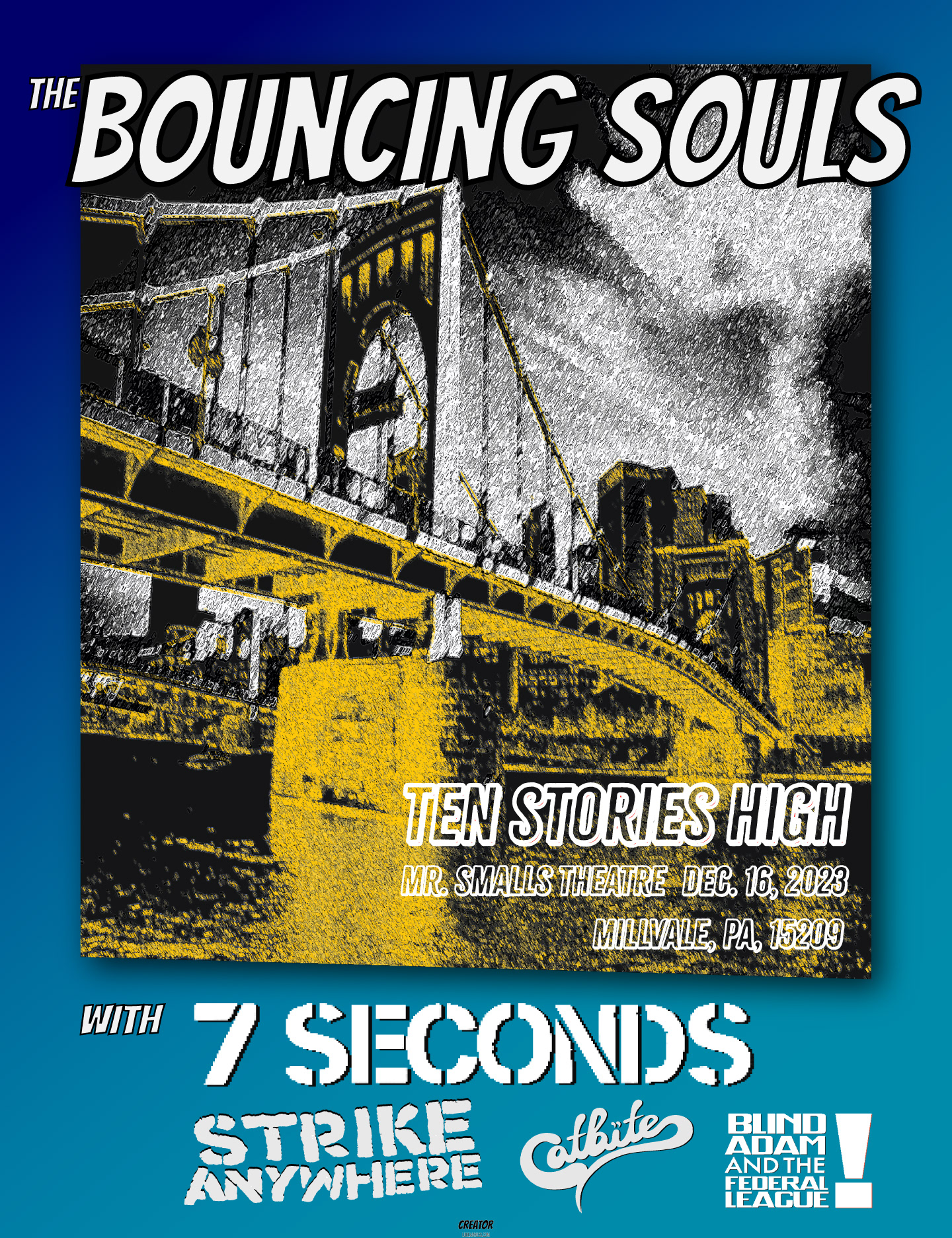
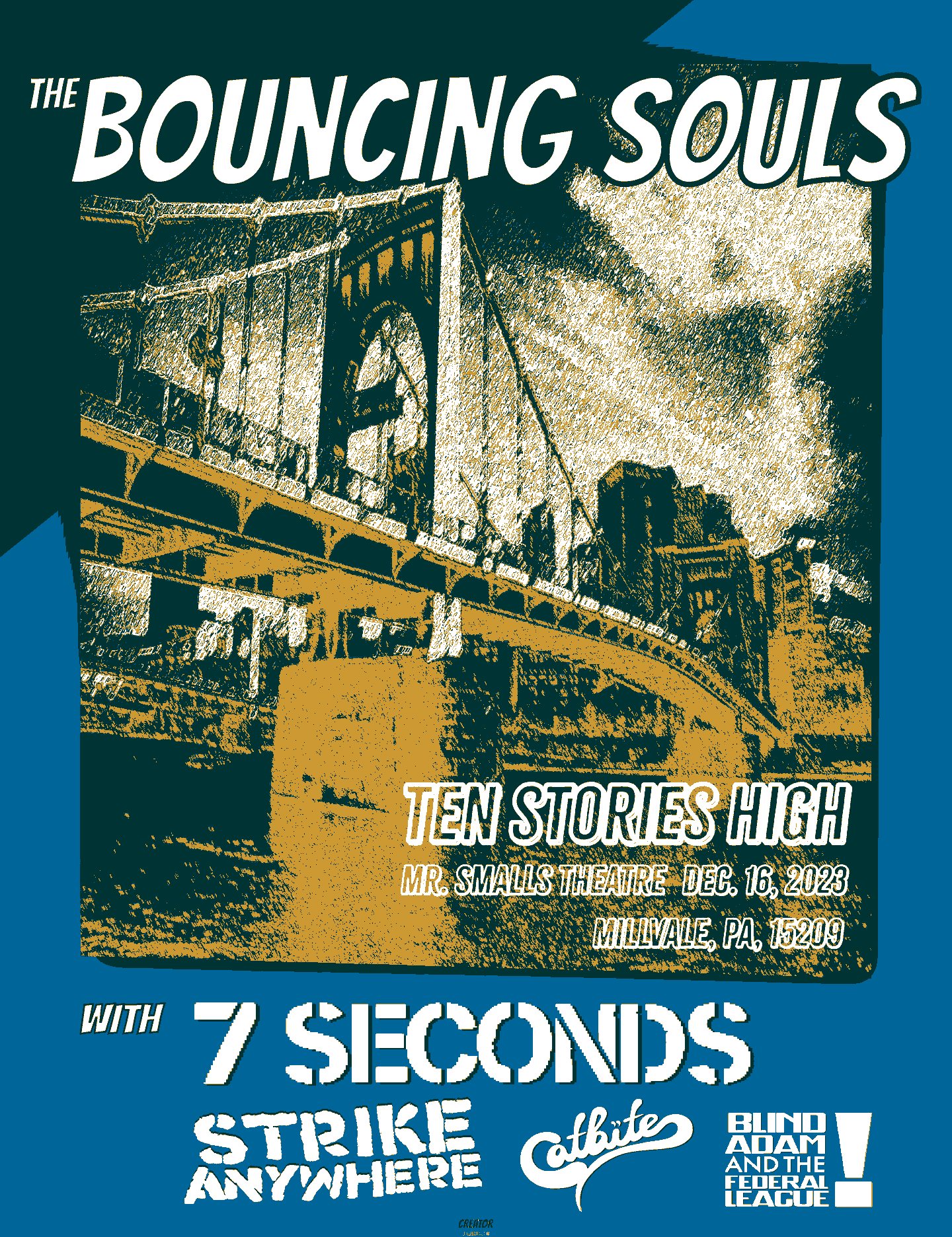
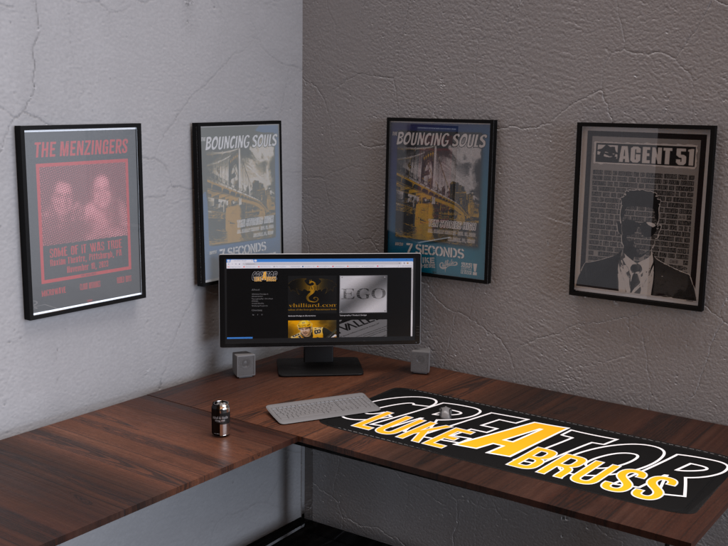
Gig posters crowd the walls around my desk. They serve as creative inspiration as well as memories of Crucial Moments. The top pair of posters - one in full color meant for mass production, and the other a three-color limited run screen print - is for the Bouncing Souls' show in Pittsburgh during their Ten Stories High tour.
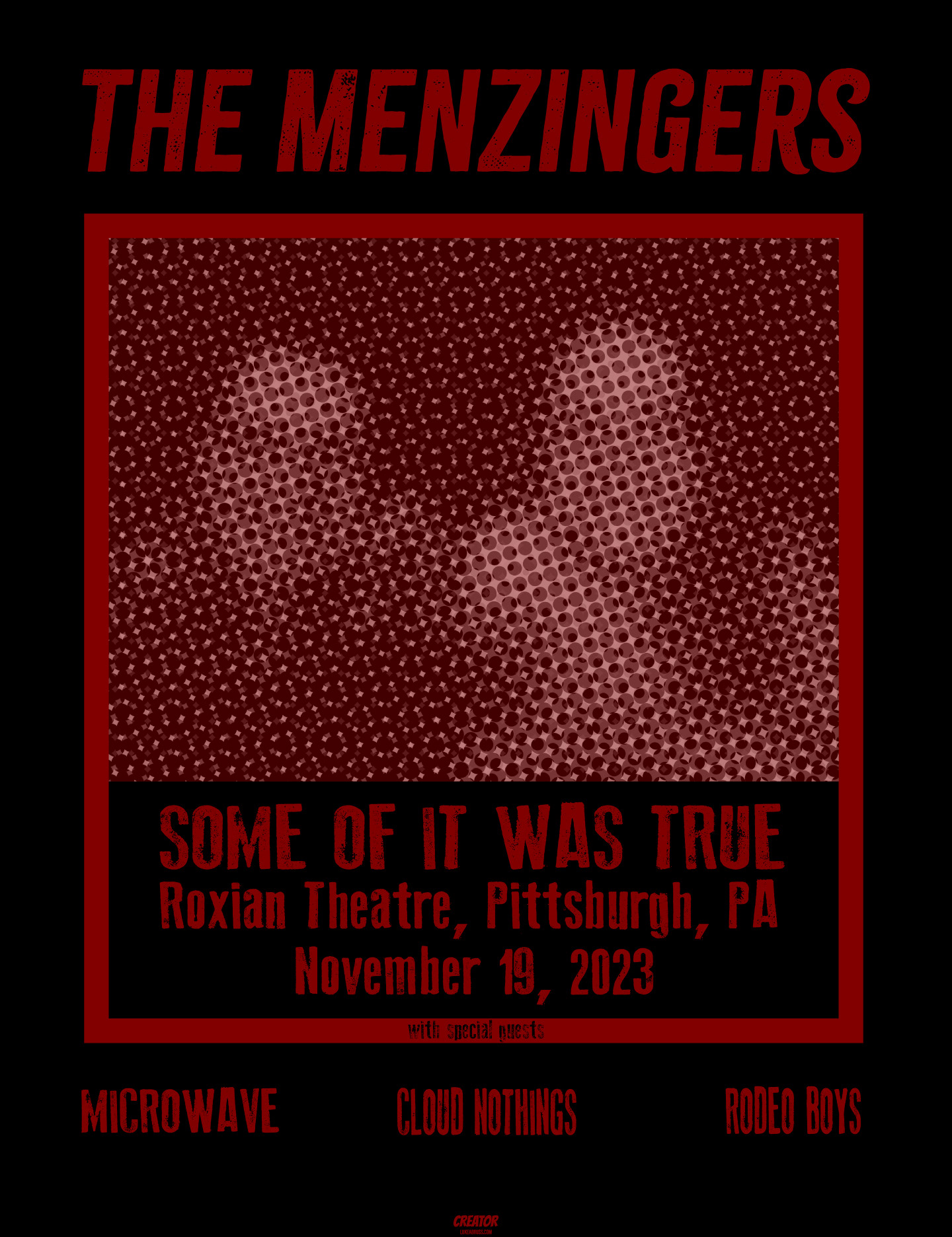
The next row features a tongue-in-cheek take on failed relationships where one party decides the grass might be greener in another's arms, while trying to rationalize it by telling their spurned lover that "some of it was true" which just so serendipitously happened to be the name of the latest Menzingers' tour. I like how this one turned out because upon first glance it's a cute picture of a happy moment, but once you zoom in for a closer look it's a mess of confusion and indecipherable chaos.
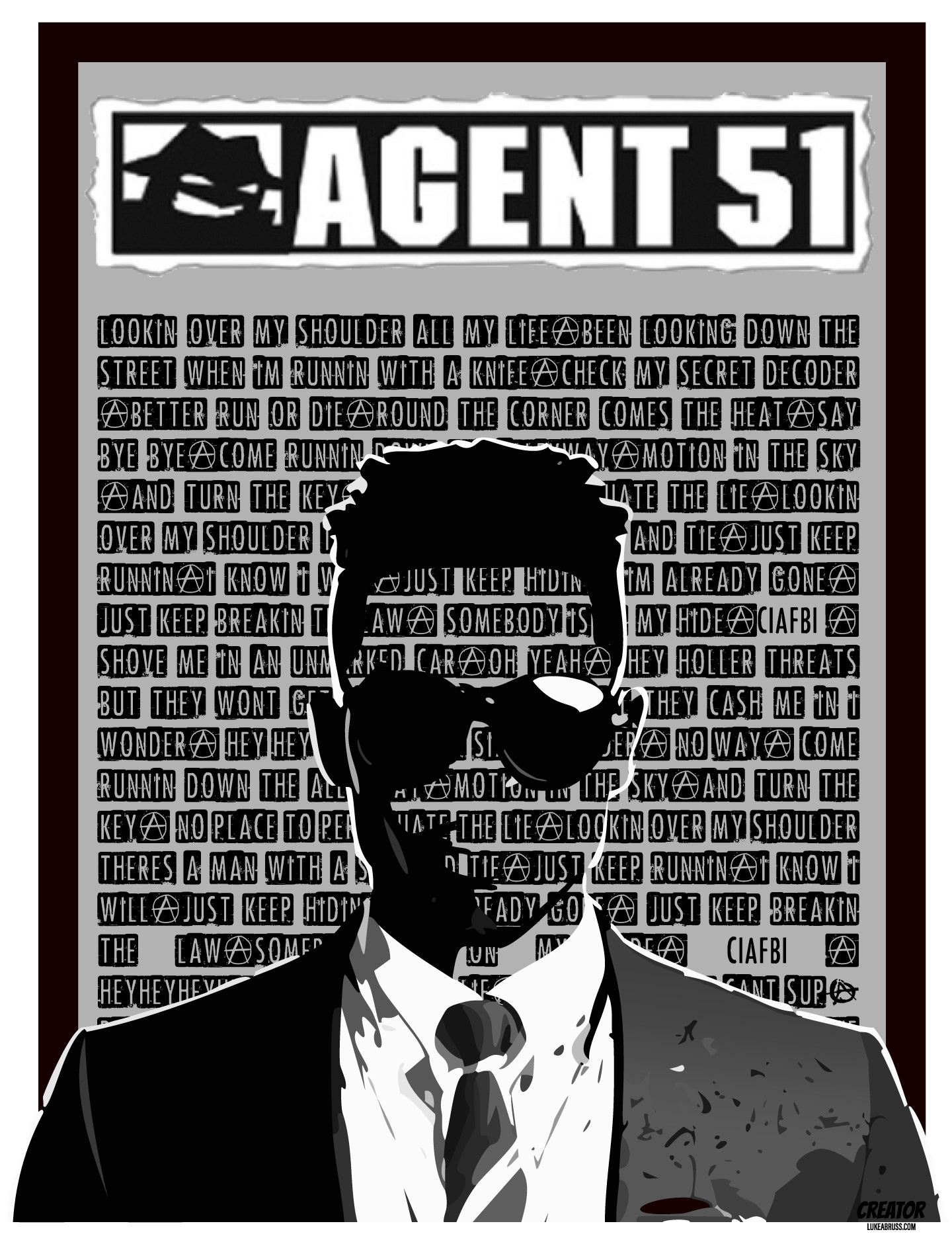
The fourth image is having some typographic fun creating a poster showing the lyrics of "C.I.A.F.B.I." by Agent 51.
OBJECTIVE:
Create promotional materials for J.V. Hilliard, as referenced in the Web Design section. Convention signage, swag bags, t-shirts, dice bags for table top RPGs, and XXL desk pads are just a few of the products we came up with.
RESULTS:
As mentioned in the results section of the Web Design page, attendance at conventions and signings has gone through the roof. Hundreds of swag bags have been released into the wild; all filled with JVH-branded goodies.
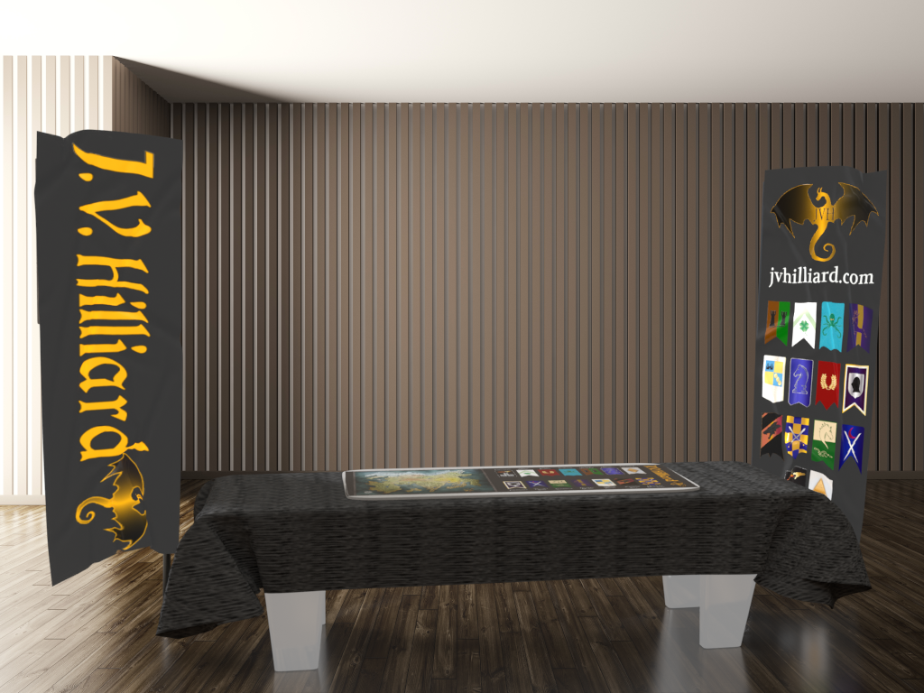
convention signage mockup
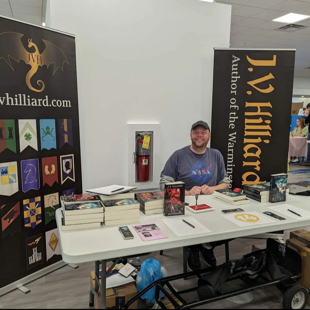
convention signage
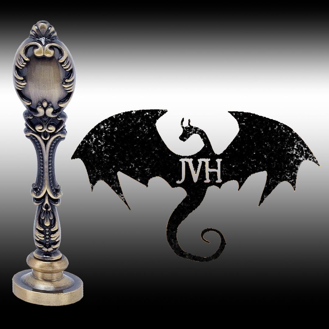
authenticator stamp
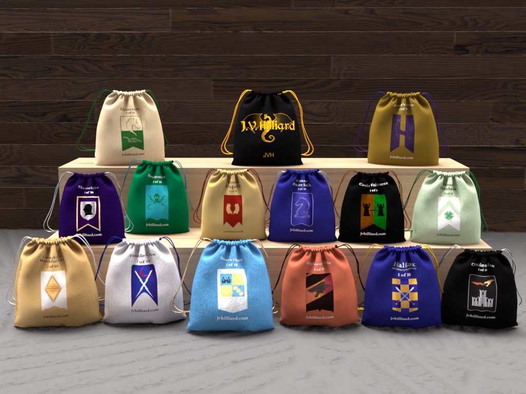
sigil dice bag mockup
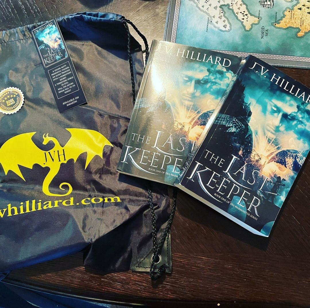
the swag bag
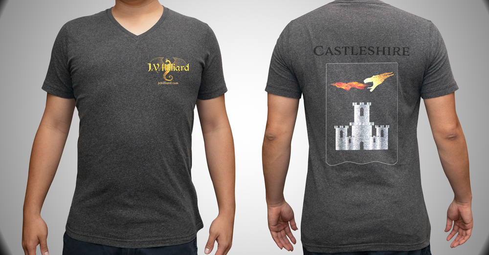
sigil t-shirt with proposed updated logo

XXL deskpad showing map and sigils
The NHL has had great success with the vintage jerseys for both the Winter Classic and retro jerseys. Why not go REALLY retro and dig deeper into the roots of the game in cities across the League with the creation of Hometown Heritage Nights? For example, Pittsburgh, who has perhaps the deepest roots of the pro game, can pull on recreations of the maroon jerseys that the Pittsburgh Athletic Club wore in WPHL championship runs in 1899, 1900, and 1901.
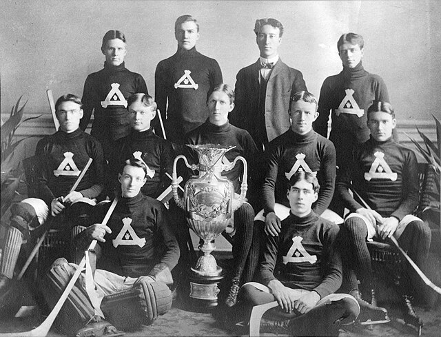
Inspiration
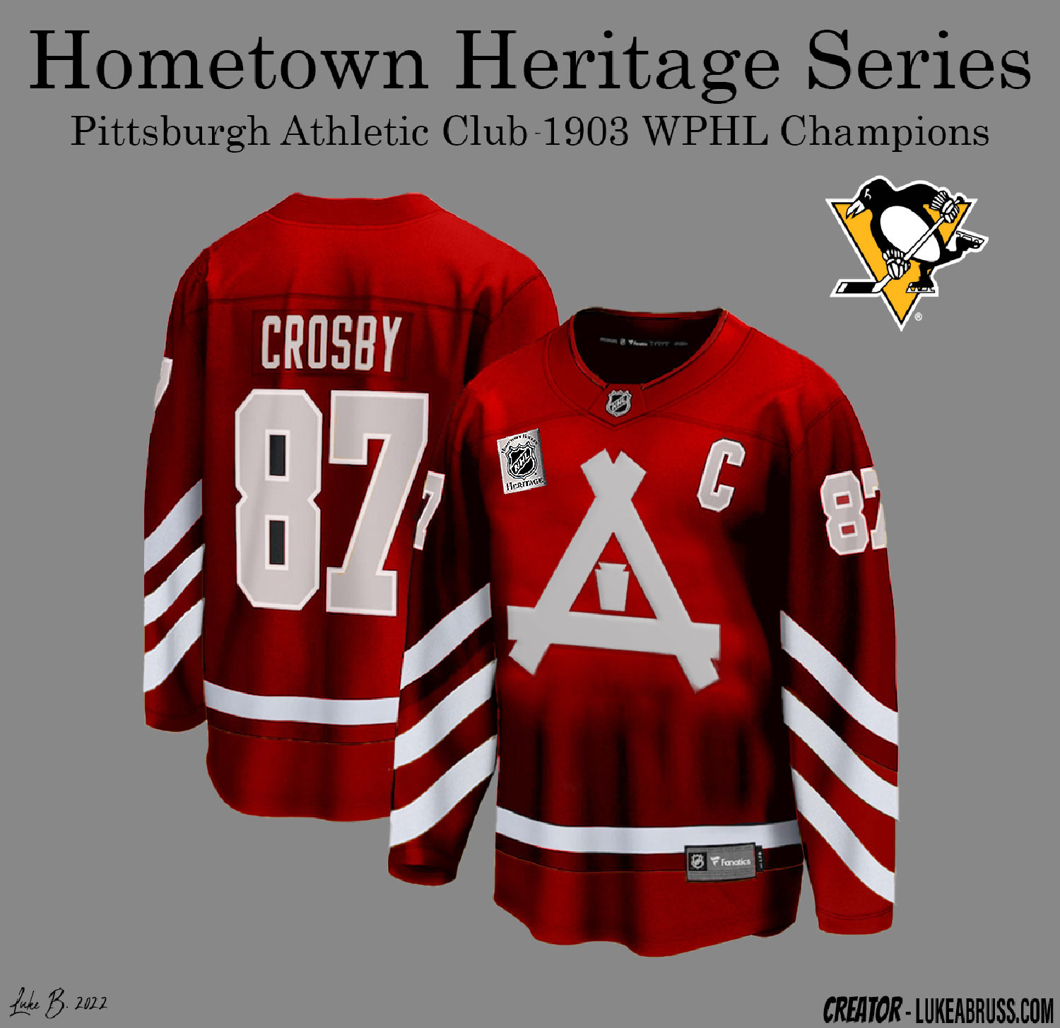
Initial mockup
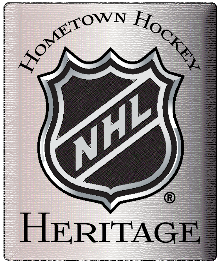
Commemorative jersey patch
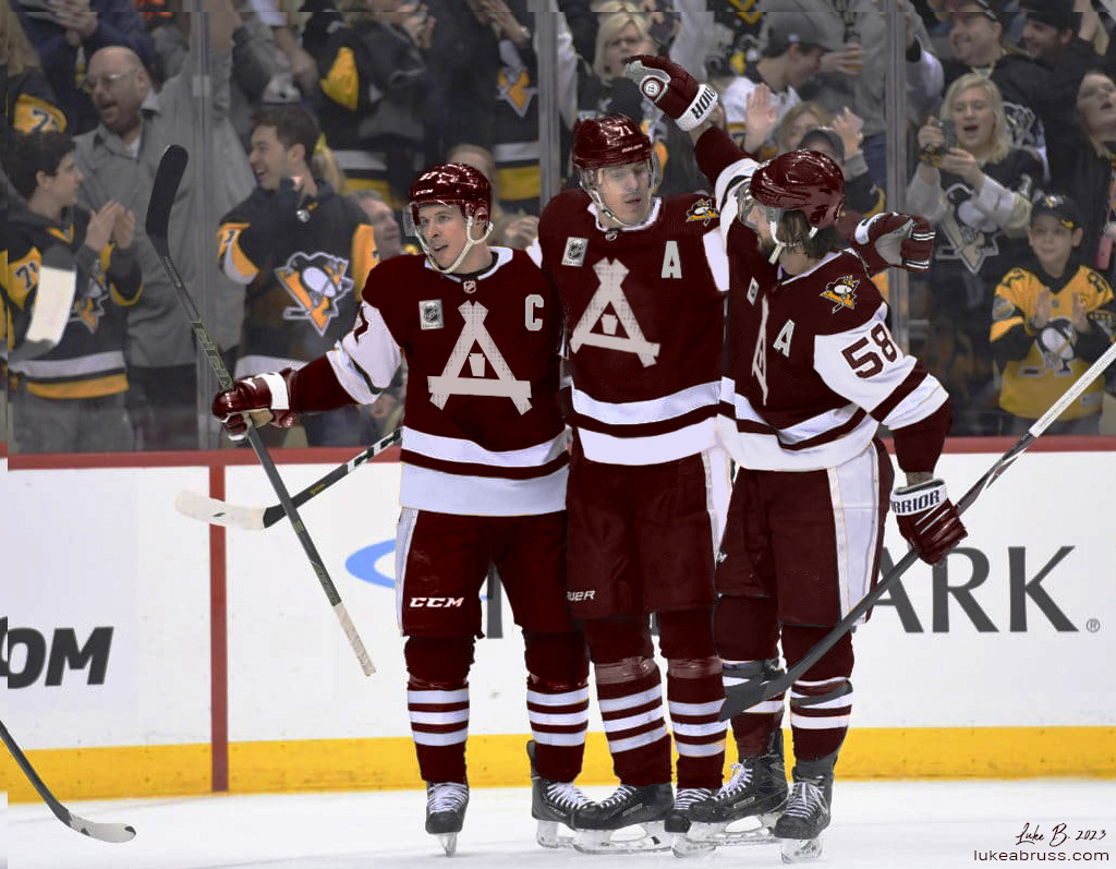
On-Ice product
A small exercise in kinetic typography. Graphics created in Illustrator; video created in After Effects.
