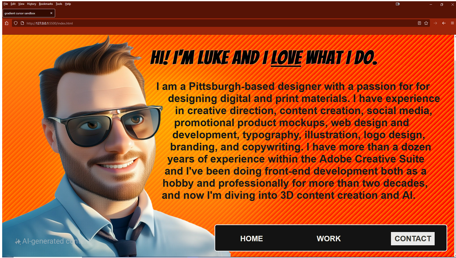
I am currently redesigning this website. I'll be incorporating GSAP and barba.js for a much more immersive experience. Stay tuned!
OBJECTIVE:
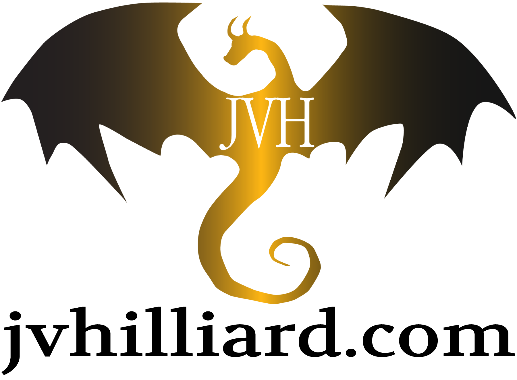
1: Design the logo and promotional materials for J.V. Hilliard, the debut author of the four-part Warminster series of fantasy novels. There was interest in having both a dragon and an ink spot incorporated into the logo, but a dragon flying above a splatter seemed like a poor choice...
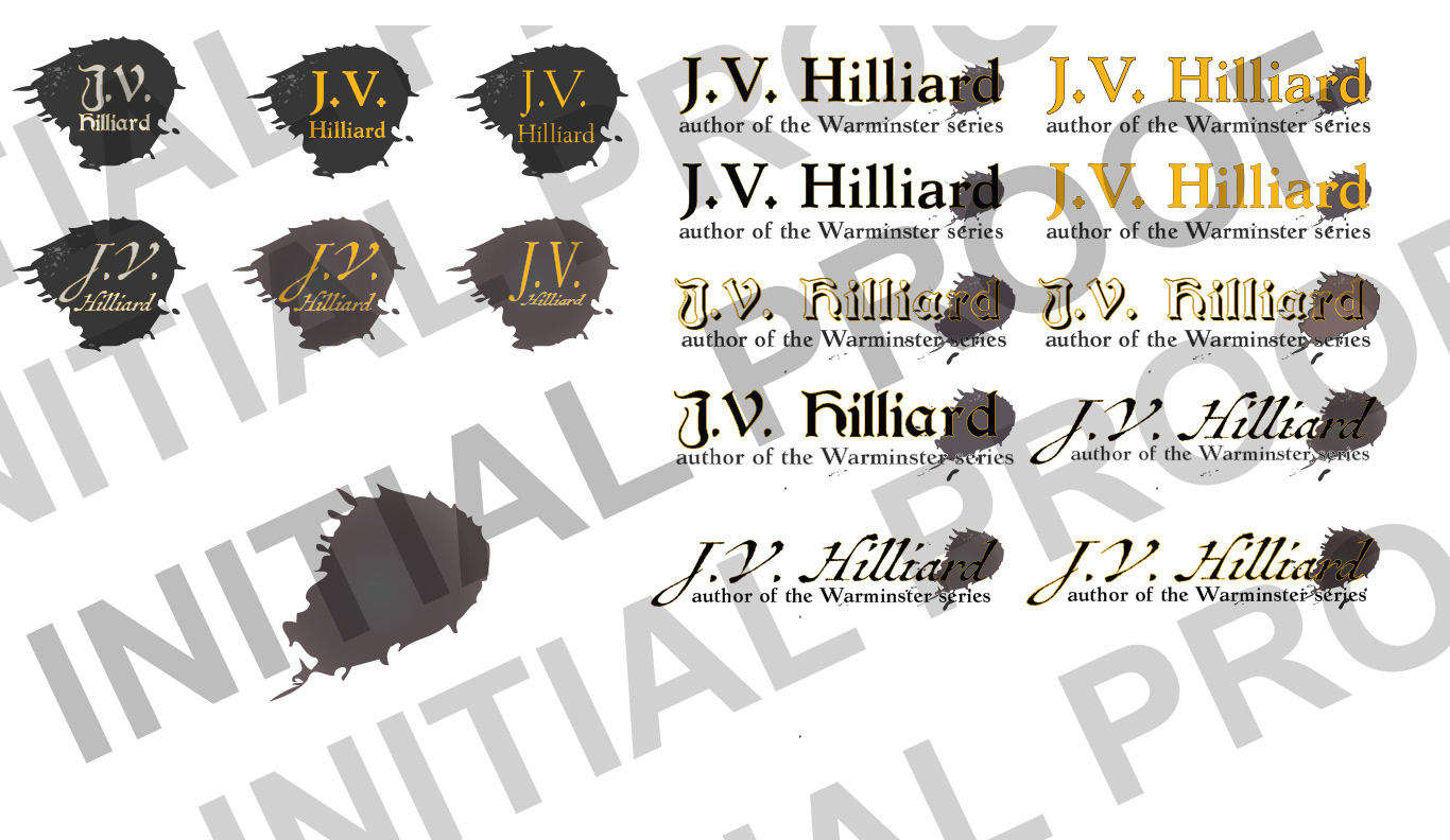
Initial idea: an ink spot monogram and logotype
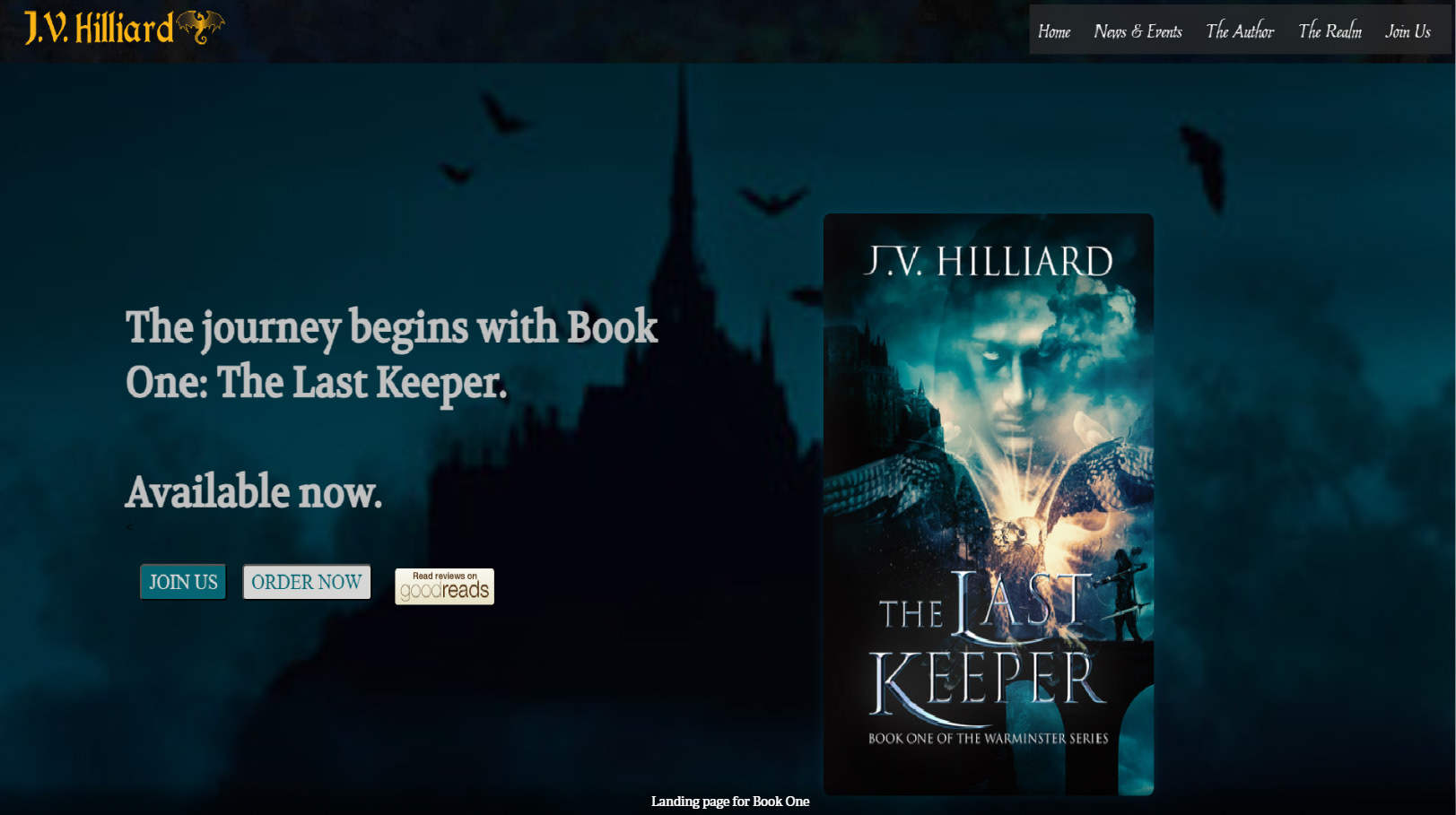
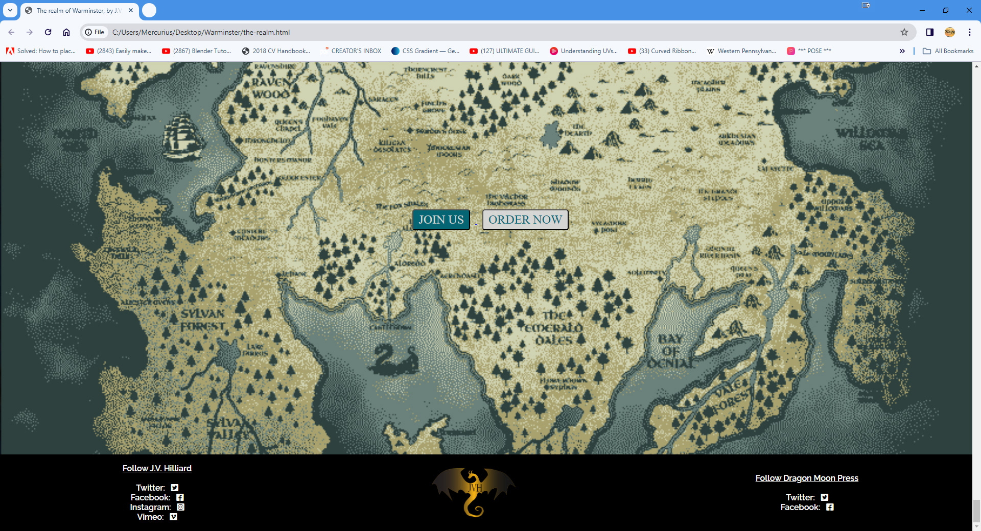
2: Design and develop the author's website* (see note below) which will be the primary sales funnel and an information hub for his fanbase to stay up-to-date on the latest from the Realm of Warminster.
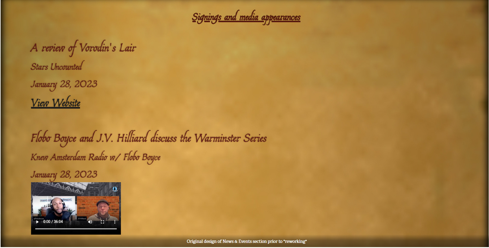
To maintain a uniform look, the design theme for The Realm was changed to match the quill and scroll look of the signings and appearances page. As the reader scrolls down through the stories they would land on CTAs to sign up for the MailChimp newsletter and a link to purchase Book One.
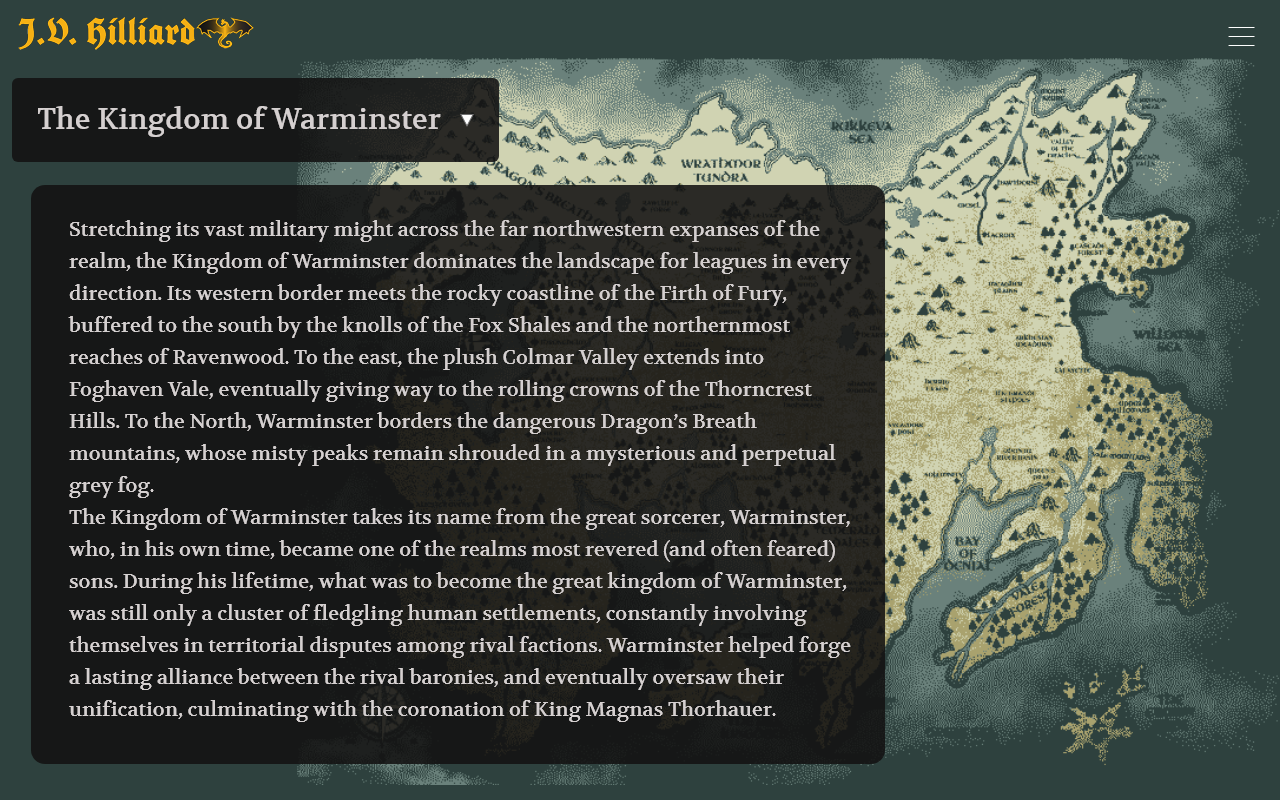
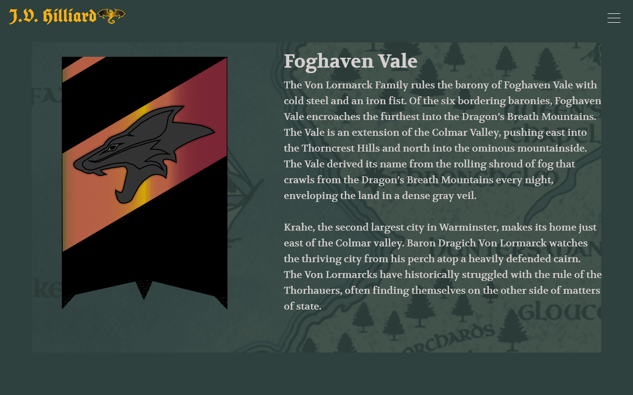
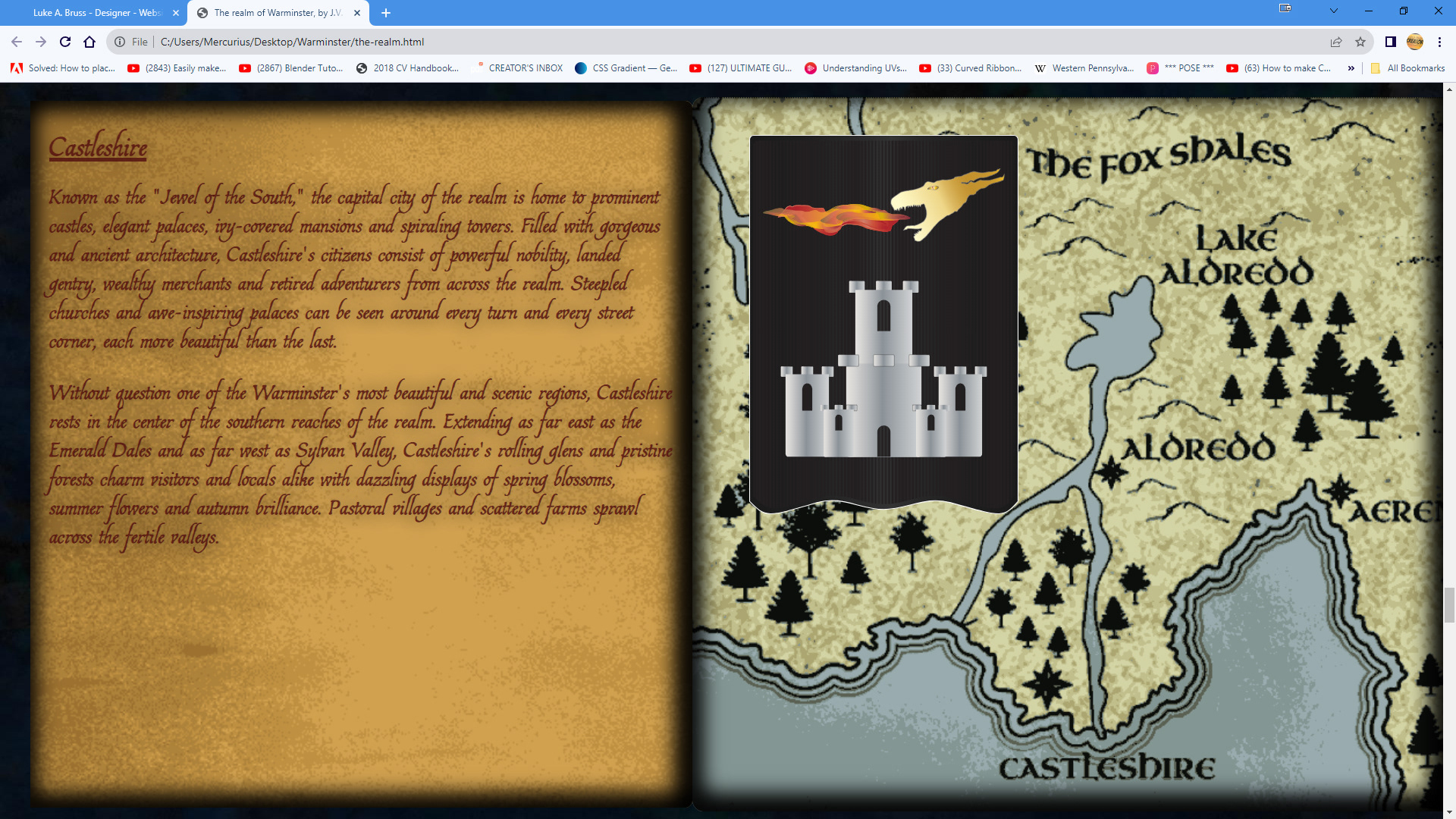
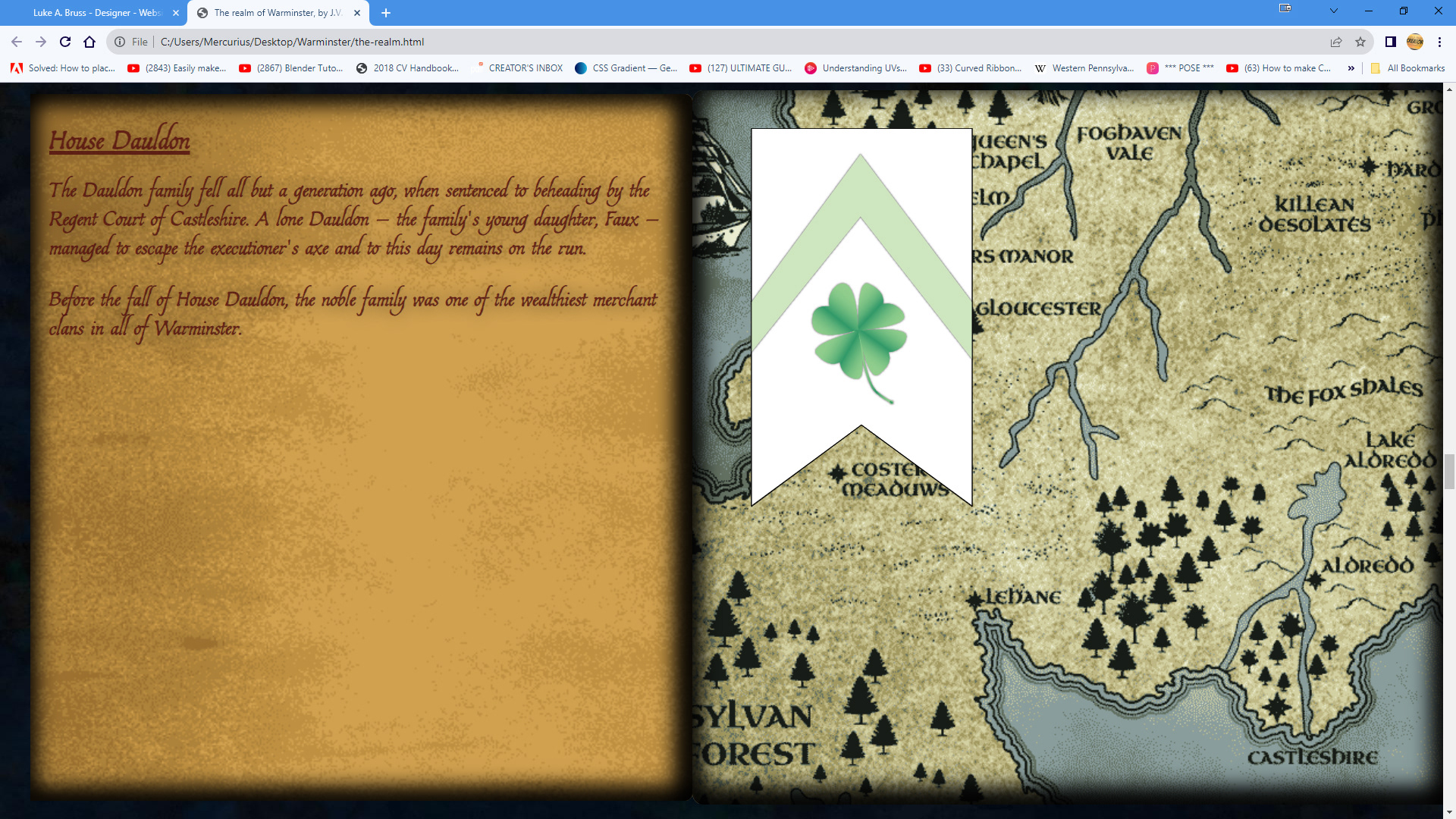
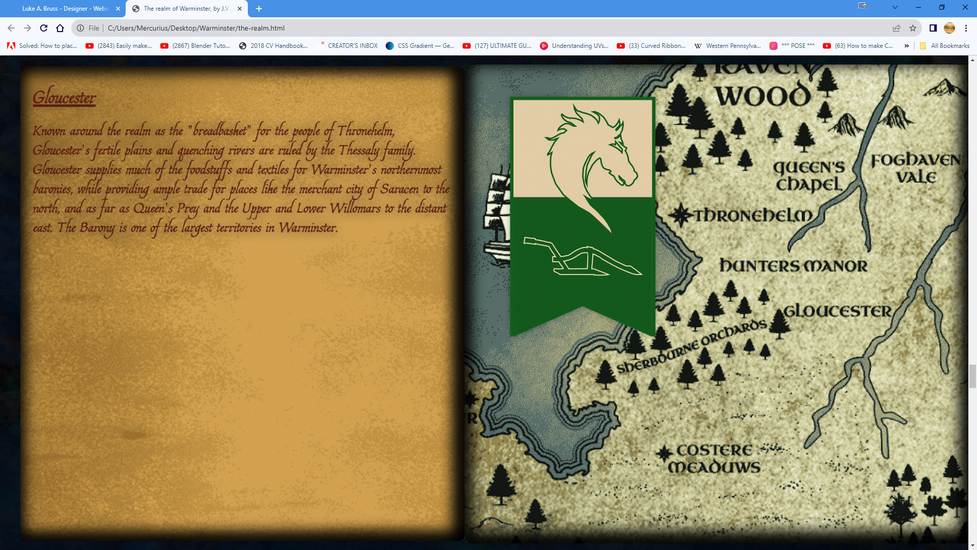
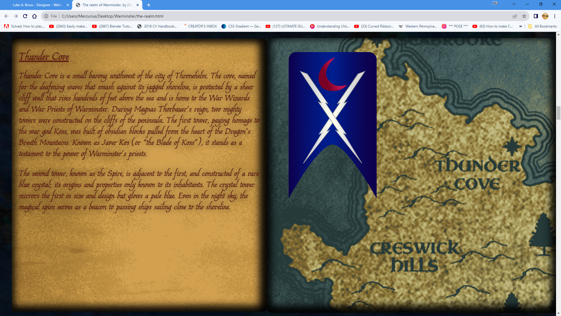
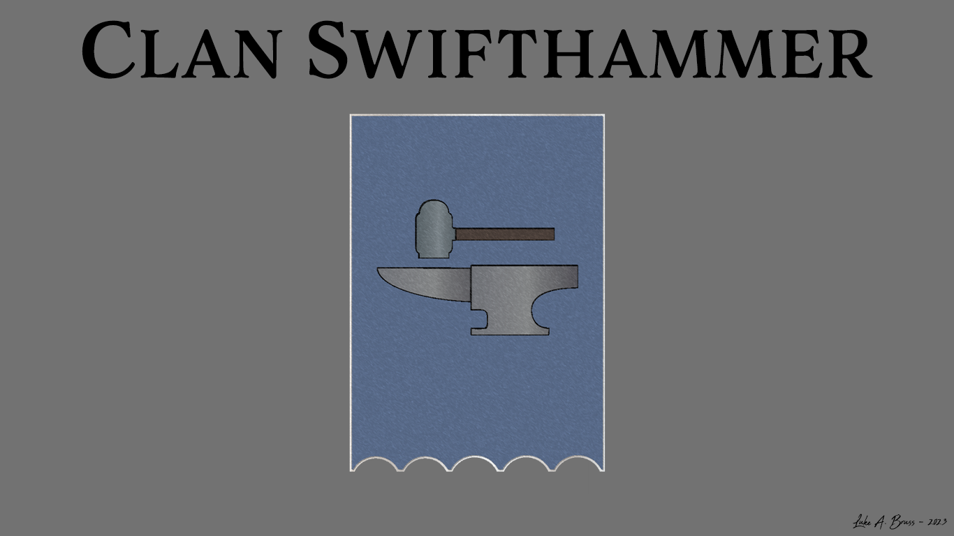
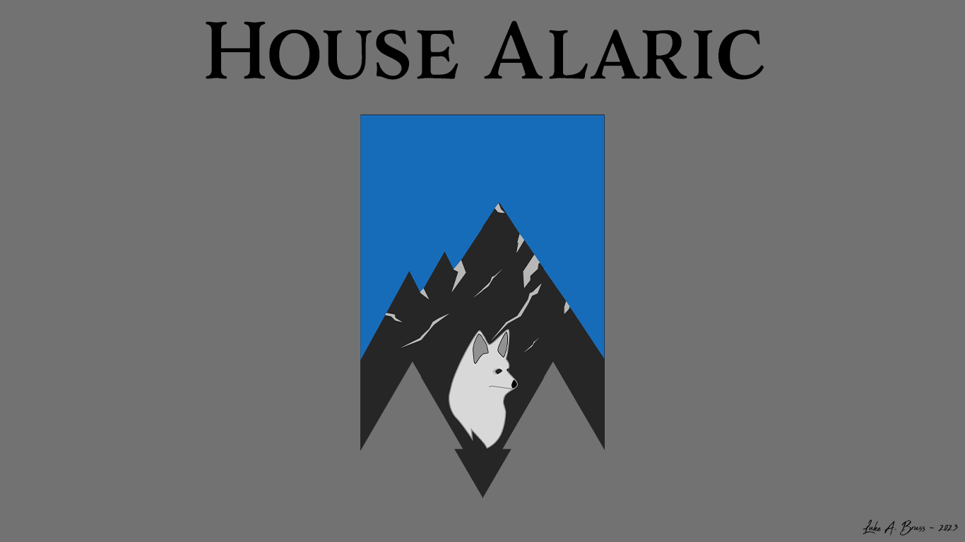
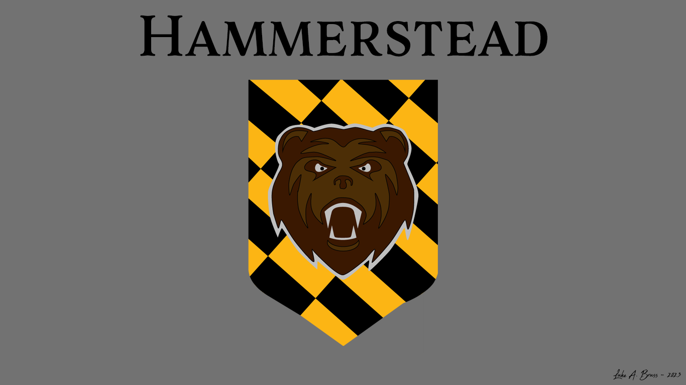
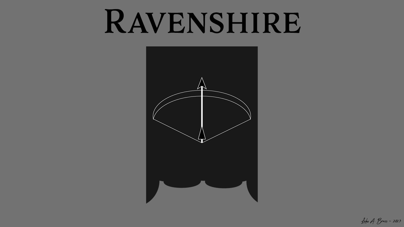
3: Using the author's creative briefs, design the website illustrations, most notably for The Realm section, which tells the individual stories of the prominent families and regions within the Realm of Warminster. These are just a few more unreleased sigils, which remain property of Luke A. Bruss until a fee can be agreed upon.
RESULT:
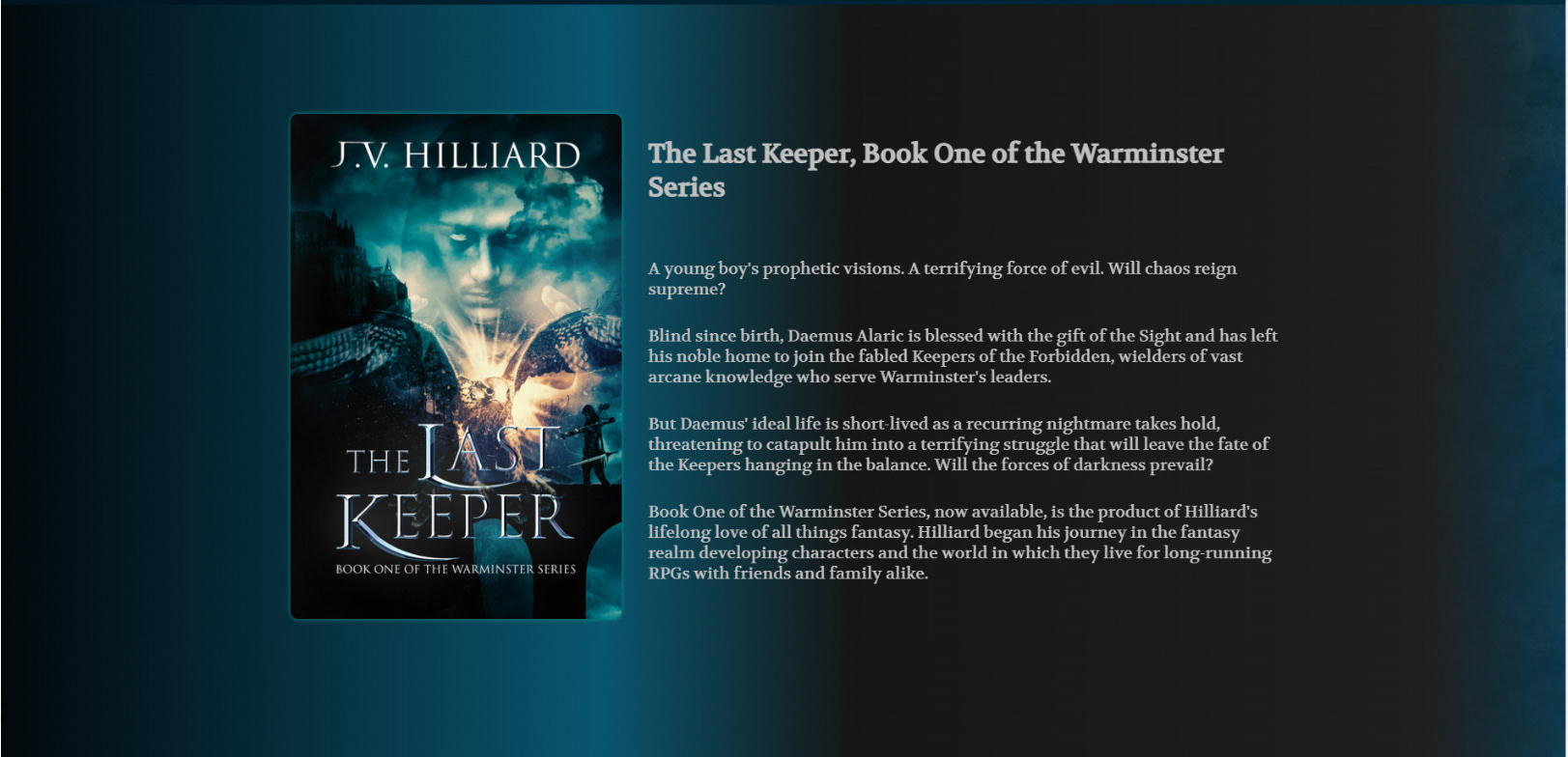
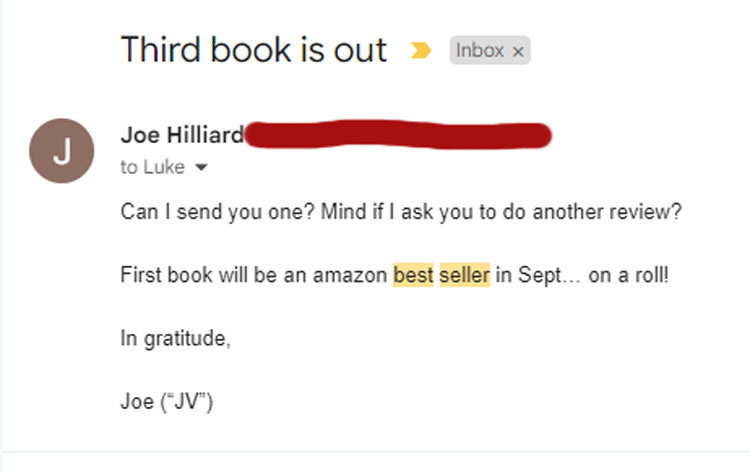
The Last Keeper became an Amazon best-seller, attendance at conventions has gone through the roof, and site traffic has increased exponentially!
"Five stars for Creator Luke A. Bruss. He collaborated with me in designing and developing my initial website as well as my logotype and monogram, which I use on my mailing labels, letterhead and most importantly—as my author stamp which goes into all of my autographed books as my certificate of authenticity. He also designed my first line of Coats of Arms for the royal families of Warminster and created my overall branding and promotional materials such as stickers, dice bags, drawstring bags, giveaways, new promotional products like collectible coins, scrolls and gameplay mats. I will most certainly use him for future work as the series progresses and I highly recommend that yo do the same!"
--JV Hilliard--
DISCLAIMER:
*The website mentioned above has been substantially altered by the client. It no longer represents the talents, knowledge or work of Luke A. Bruss.